Stardew Valley Menu Redesign
Finding the Problem 🤔
Role
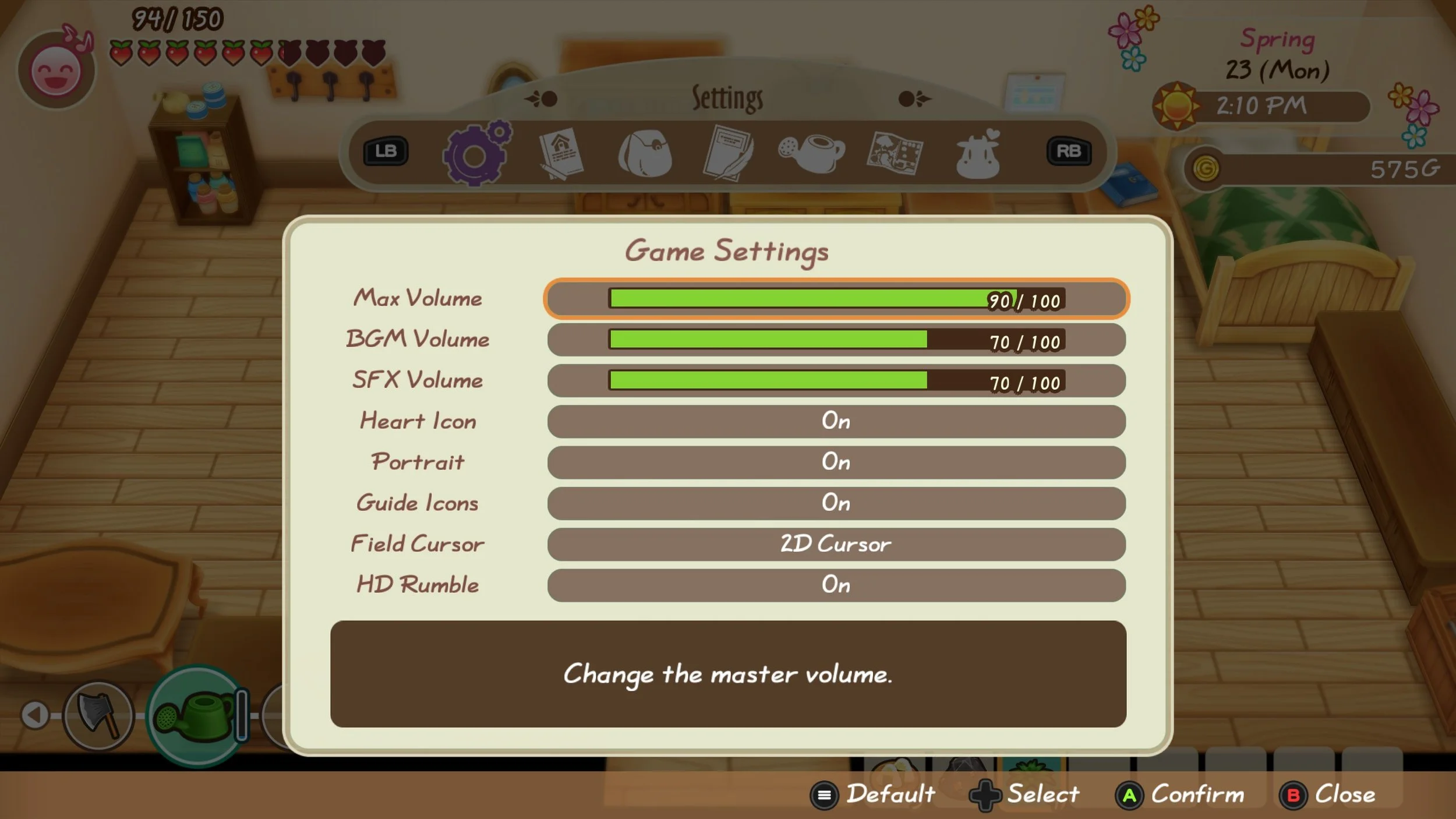
While Stardew Valley’s in-game settings menu resonates with the game’s visual aesthetic, it suffers from poor organization, being solely accessible when playing the game, and addressing accessibility issues on a smaller scale. To combat these identified issues, the Stardew Valley UI redesign concept aims to craft a more cohesive and accessible settings menu through the following:
UI Designer
Duration
3 Months | October – January 2024
Tools
Figma, Adobe Photoshop, Miro, PowerPoint
Allowing Stardew Valley’s in-game Settings menu system to be accessible from the game’s main menu
Redesigning Stardew Valley’s (iOS mobile, tablet, and desktop versions) menu UI and settings
Proposing a Solution 💡
During my three months in CareerFoundry’s UI for UX Designers course, I crafted a redesign of Stardew Valley’s settings menu that could be accessed within the game’s main menu screen. I structured the menu redesign based on previous examples of settings menus within games of the same genre and incorporated elements of Stardew Valley’s original settings menu. I delivered wireframes for both mobile, tablet, and desktop platforms, a functional mobile prototype, self-created UI elements, a logo redesign, and a style guide. My settings menu redesign garnered praise for its attention to detail regarding retaining the game’s visual qualities, addressing potential accessibility barriers, and elevating the menu’s ease of use.
Design Process 📖
Discovery
Research 🔍
To uncover valuable methods for redesigning Stardew Valley’s settings menu system, I decided to search for some examples. Thus, I researched games of the same genre that already incorporated a settings menu within its main menu screen. My analyses of these menu systems allowed me to generate ideas for my redesign’s organization, layout, and visual design.
User Stories 👤
To better identify users’ motivations towards desiring specific changes to Stardew Valley’s settings menu system, I jotted down a list of user stories. By looking through my crafted user stories, I was able to deduce two crucial aspects that needed consideration:
As a user, I want the menu settings to be organized more effectively, so I can have an easier time navigating the long list of settings.
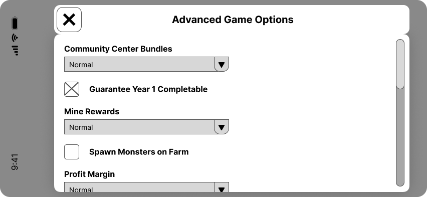
As a user, I want the advanced menu settings to be accessible in the main menu, so I can adjust these settings before starting a new game.
User Flows 🖱️
To uncover potential visual solutions to my redesign, I began creating user flows for each of these user stories. Crafting a visual interpretation of how a user would interact with my redesign to attain their goals allowed me to gain a greater comprehension on how to provide a user-focused visual experience towards problem areas within the game’s current settings menu:
Sitemap 📍
Taking these areas of focus and visual design into consideration, I began creating a sitemap. This would allow me to both visually interpret the placement of content and uncover potential solutions towards crafting a more organized, user-friendly interface:
Concepting
Low-Fidelity Sketches✍️
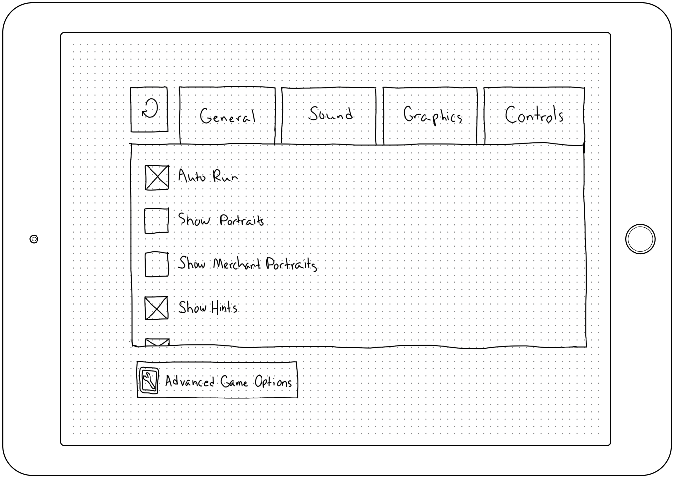
To envision how my developed structure for my redesign would transfer to a visual medium, I started sketching examples of how each screen would appear on a mobile device. This paved the way for starting to transfer my mobile screen designs for both tablet and desktop, for which I made digital sketches for the main menu and general settings pages:
Mobile
Tablet
Desktop
Mid-Fidelity Wireframes 💻
Completing my initial sketches, I transferred my concepts into mid-fidelity wireframes. These wireframes would be used to further establish the layout of the design based on the previously established grid systems and to refine the overall design:
Mobile
Tablet
Desktop
Analysis
Grid Systems 🏁
With the intention of creating my redesign with different iOS breakpoints (mobile, tablet, and desktop), I built a grid system for each platform. This helped me to accurately place content on each screen in an organized and efficient manner:
Mood Boards 🖼️
To gain a greater perspective on how I should present the visual design of the redesigned settings menu, I began crafting two mood boards. One of the mood boards covered the atmosphere one experiences when playing the game (Seasonal. Agricultural. Calming), while the other covered the plot line elements of the game (Friendship. Adventure. Free.). In summation, I ended up choosing the mood board that reflected the game’s atmospheric qualities (Seasonal. Agricultural. Calming), as I believed it would be more beneficial in keeping the game’s visual aesthetic intact:
Color Palette 🖌️
To further unpack how I desired to present the visual aspects of my redesign, I came up with three color palettes. Utilizing established colors within the game mixed with similar color schemes helped me establish palettes that were representative of Stardew Valley’s visual presentation. I also wanted to consider accessibility, so I chose color combinations that passed the WebAIM Contrast Checker to ensure these needs were addressed. Ultimately, I chose the color palette that reflected my chosen mood board, which reflected the game’s seasonal, natural vibe:
Typography ✏️
To continue my goal of preserving Stardew Valley’s visual aesthetic, I wanted to ensure that I chose a typography that would accomplish my goal. Through my research, I stumbled upon fan-made fonts which greatly resembled the actual in-game text. Thus, I decided to use these fonts for my redesign:
Images & Iconography 🌄
Also, I wanted to make sure the images and iconography I used in my redesign also reflected Stardew Valley’s visual design. As a result, I utilized actual images and icons that were already present in the game. I decided to use the iconic landscape image used in the game’s main menu screen as a background image for my screens, and incorporated specific icons to help users establish a connection between the button being pressed and the visual being presented:
Logo Design ⭐
When designing various fidelities of wireframes, I noticed the reimagined logo didn’t possess the previous logo’s vibrant quality due to its letters being uncolored. To remedy this fact, I recolored each letter to provide a similarity to the original design while creating a unique, painter-like approach to Stardew Valley’s logo:
Outcome
UI Elements 👾
Text Styles 📝
Style Guide 🎨
High-Fidelity Wireframes 📱
Mobile
Tablet
Desktop
Final Design 🎀
Learning
Next Steps 🛠️
There were three areas I believe could be worked on in future iterations of my redesign:
Design missing screens for tablet and desktop breakpoints
Would allow for greater design visualization of breakpoints and offer greater opportunities for design improvement
Craft prototypes for tablet and desktop breakpoints for future testing
Users would be able to test the various designs based on each breakpoint, thereby allowing more ability to improve design functionality
Incorporate and visualize accessibility menu features
While accessibility feature concepts were implemented in the design, this could be pushed further to include visual mockups and functional prototypes of how these concepts would look and function in-game


